Overview
The Patient Population section of the Facility Analyze Page contains patient demographics that make you the expert on your selected facility's patients. These metrics are found under the Patient Population tab.

 In this article
- Chart View
- Patient Volume - Trended counts of patients over eight quarters
- Inpatient CMS Payer Mix - Distinct Patients - inpatient patient counts for Medicare FFS, Medicare Advantage, and Medicaid discharged from the selected facility
- Outpatient CMS Payer Mix - Distinct Patients - outpatient patient counts for Medicare FFS, Medicare Advantage, and Medicaid discharged from the selected facility
- Patient Locations - County - percentage of patient's county of residence.
- Diagnostic Breakout by Stay - counts of patient stays by Trella Health Diagnostic Group or MS-DRG for HHA patients discharged from the selected facility.
- Chronic Conditions - Breakdown of patients by chronic condition diagnoses
- Patient Age Groups - Breakdown of patients by age.
Chart View
At the top left of the page you will find a toggle icon that allows you to turn chart view on and off. With chart view on, some content will be shown as a chart, with chart view off, most content on the page will be shown in tables.
![]() Not all tables have a chart view, and some charts don't have a table view.
Not all tables have a chart view, and some charts don't have a table view.
Chart View On |
Chart View Off |
 |
 |
|
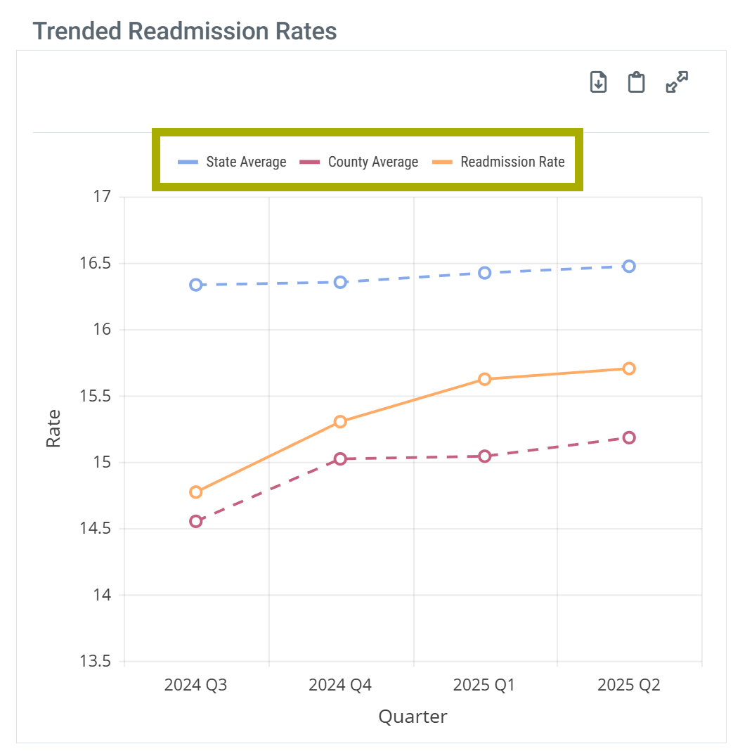
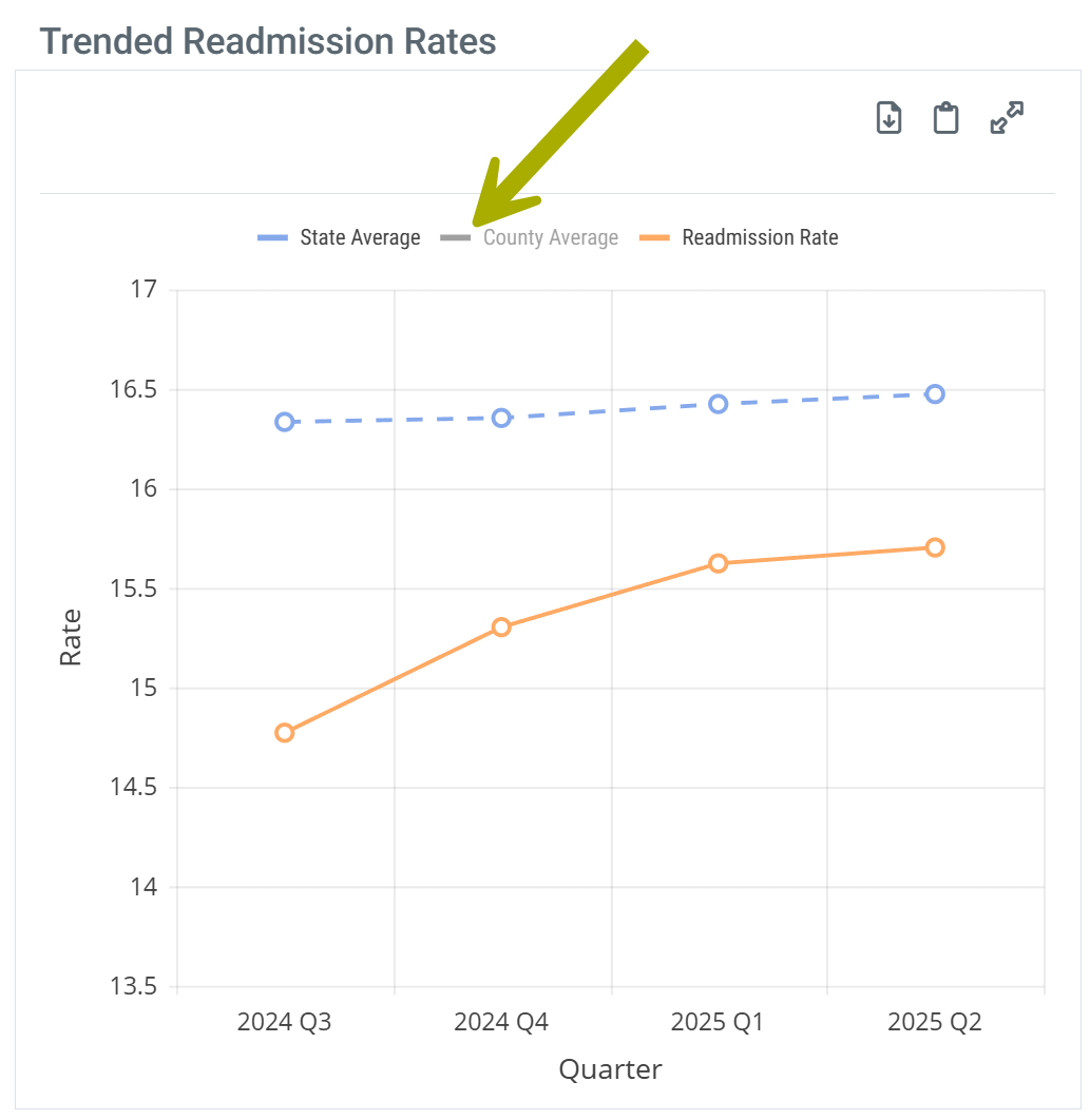
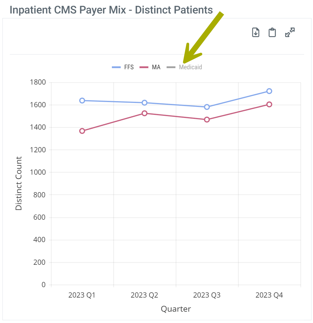
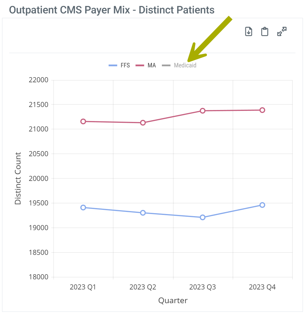
Legend - Some charts have a legend that identifies the elements in the chart. Each different identifier in the legend can be toggled on and off to display or hide the matching elements in the chart. Hovering over an identifier highlights the related elements in the chart.
| |
 |
 |
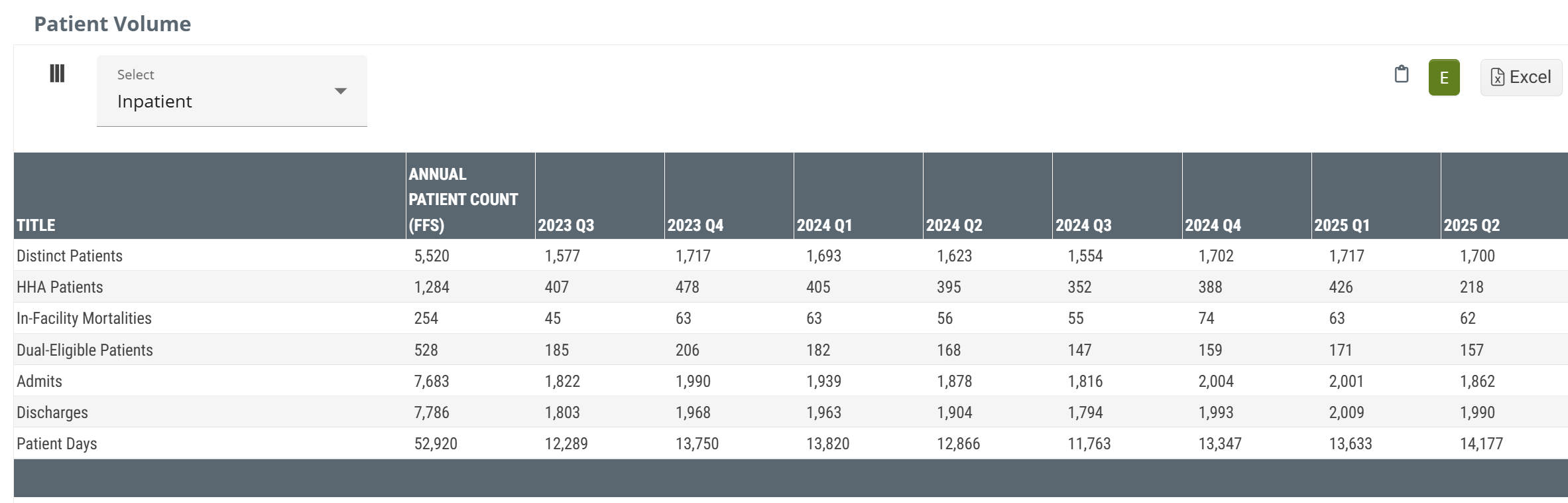
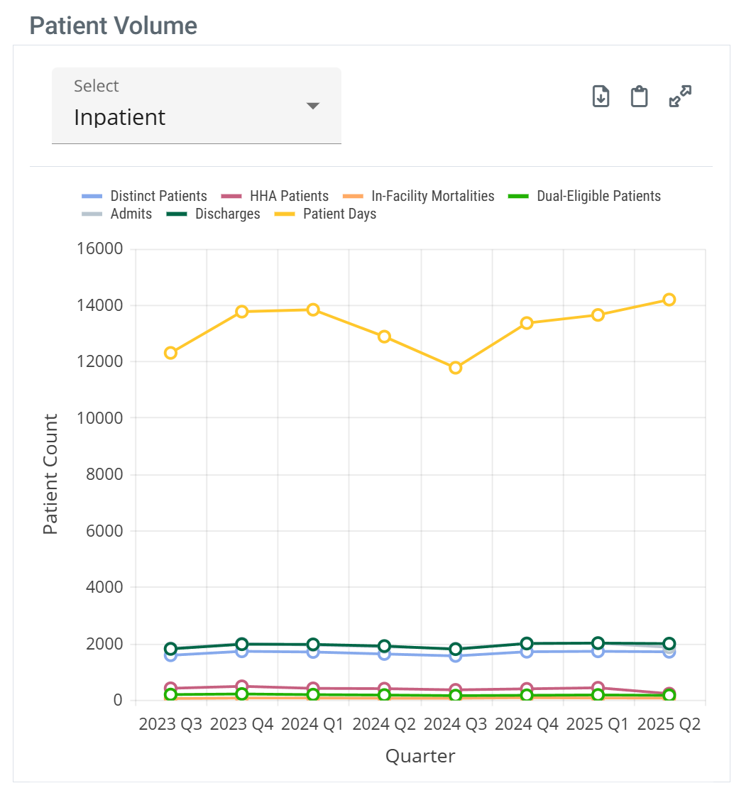
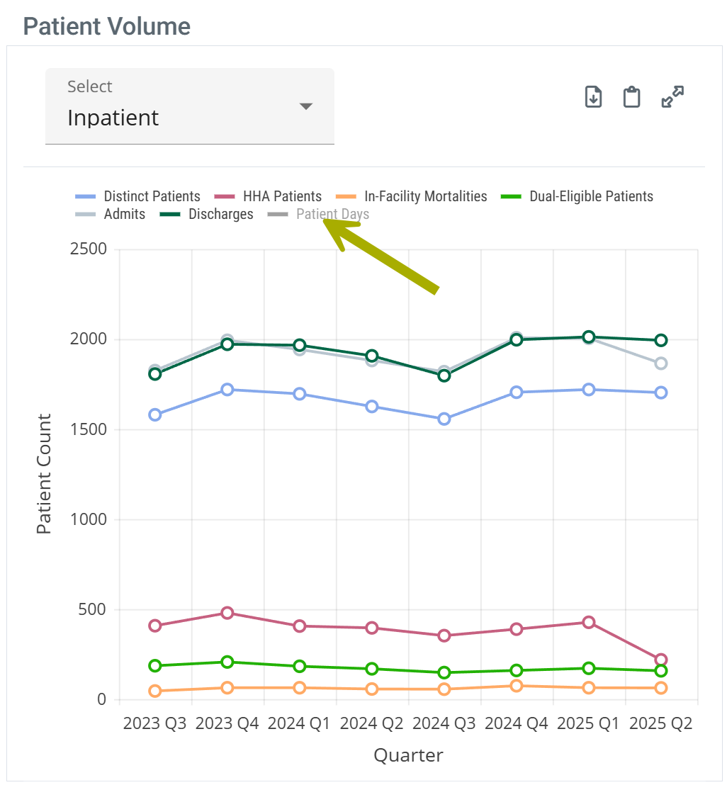
Patient Volume Table
The Patient Volume table shows trended counts of patients treated by the selected facility.
Chart View and Table View
|
Off
|
 |
|
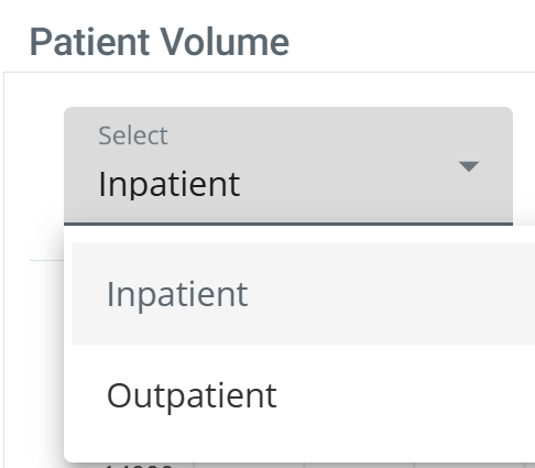
Filter Dropdown The dropdown at the top left of the table allows you to choose the claim type for the metrics in the table.
|
 |
|
On
|
 |
| When you hover over a line in the Patient Volume chart, the metrics for the different patient counts represented in the chart are displayed. | 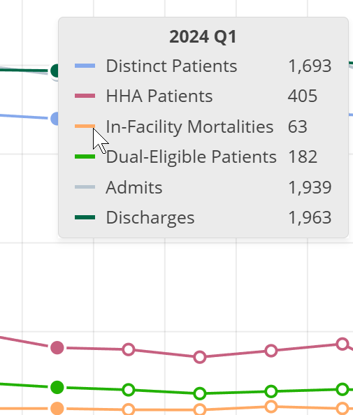 |
|
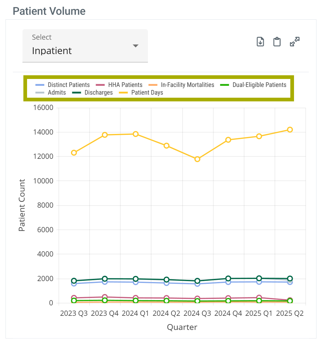
With chart view on the Patient Volume chart has a legend that identifies the elements in the chart. Each different identifier in the legend can be toggled on and off to display or hide the matching elements in the chart. Hovering over an identifier highlights the related elements in the chart.
| |
| Chart Legend | Legend Customize |
 |
 |
|
| |
Metric Details
Metric Name |
Description |
| Distinct Patients |
The count of distinct Medicare FFS patients who were discharged from the selected facility during the specified quarter.
|
| HHA Patients |
The count of distinct Medicare FFS Patients treated at the facility during the specified quarter who received home health services within 30 days of discharge.
|
| In-Facility Mortalities | The count of distinct Medicare FFS patients who were discharged from the selected facility with a discharge status code indicating the patient expired during the specified quarter. |
| Dual Eligible Patients | The count of distinct Medicare FFS patients who were discharged from the facility who were eligible for Medicaid coverage during the specified quarter. |
| Admits | The count of distinct Medicare FFS admissions to the selected facility during the specified quarter. |
| Discharges | Count of distinct Medicare FFS discharges from the selected facility during the specified quarter. |
| Patient Days | Sum of days spent in the selected facility for Medicare FFS patients who were treated by the facility during the specified quarter. |
![]() In the Trella Insights In sights for Home Health, the most recent quarter volume will always show a number that is unexpectedly small in comparison to previous recent quarters. CMS assigns home health claims to a quarter based on the through date, not the start date. Trella Health assigns claims based on start date. Thus if the claim was not completed during the quarter shown in the table, the CMS data will not reflect that claim until the following quarter, at which point we retroactively update the counts for the given quarter.
In the Trella Insights In sights for Home Health, the most recent quarter volume will always show a number that is unexpectedly small in comparison to previous recent quarters. CMS assigns home health claims to a quarter based on the through date, not the start date. Trella Health assigns claims based on start date. Thus if the claim was not completed during the quarter shown in the table, the CMS data will not reflect that claim until the following quarter, at which point we retroactively update the counts for the given quarter.
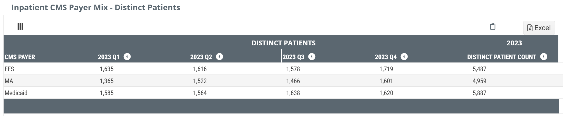
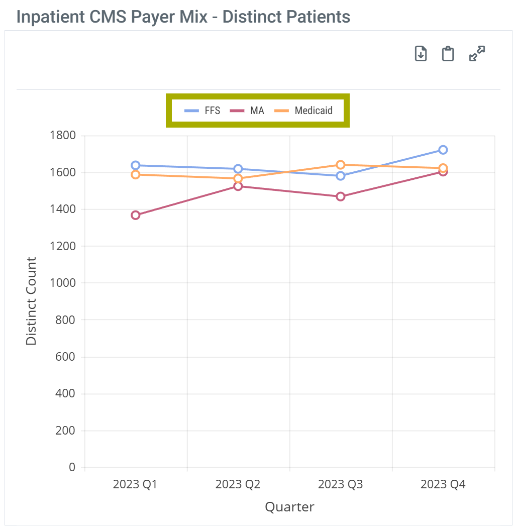
Inpatient CMS Payer Mix - Distinct Patients
This table shows distinct patient counts of inpatient patients treated by the selected facility for the most recent year where comparative metrics can be displayed for Medicare FFS, Medicare Advantage, and Medicaid. The data for the listed year are broken out by quarter to show trends.
Chart View and Table View
|
Off
|
 |
|
On
|
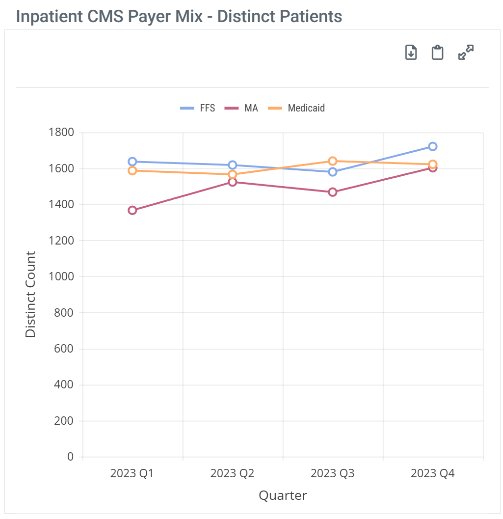 |
| When you hover over a line in the Inpatient CMS Payer Mix chart, the metrics for the different patient counts represented in the column are displayed. | 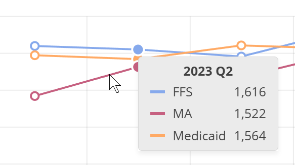 |
|
With chart view on the Inpatient CMS Payer Mix chart has a legend that identifies the elements in the chart. Each different identifier in the legend can be toggled on and off to display or hide the matching elements in the chart. Hovering over an identifier highlights the related elements in the chart.
| |
| Chart Legend | Legend Customize |
 |
 |
Metric Details
![]() The metrics in this table are about 2 years old because complete Medicare Advantage data is only available after that period. Medicare FFS metrics and Medicaid metrics are shown for the same periods in order to make comparisons meaningful.
The metrics in this table are about 2 years old because complete Medicare Advantage data is only available after that period. Medicare FFS metrics and Medicaid metrics are shown for the same periods in order to make comparisons meaningful.
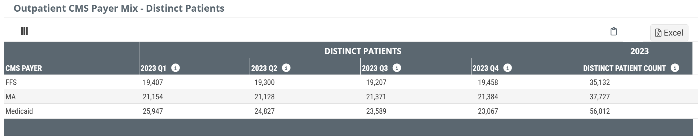
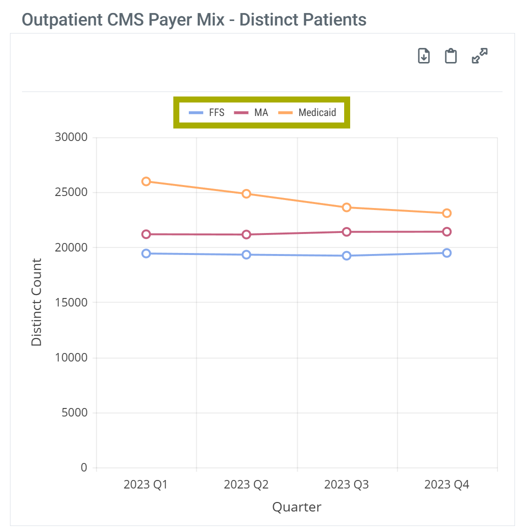
Outpatient CMS Payer Mix - Distinct Patients
This table shows distinct patient counts of outpatient patients treated by the selected facility for the most recent year where comparative metrics can be displayed for Medicare FFS, Medicare Advantage, and Medicaid. The data for the listed year are broken out by quarter to show trends.
Chart View and Table View
|
Off
|
 |
|
On
|
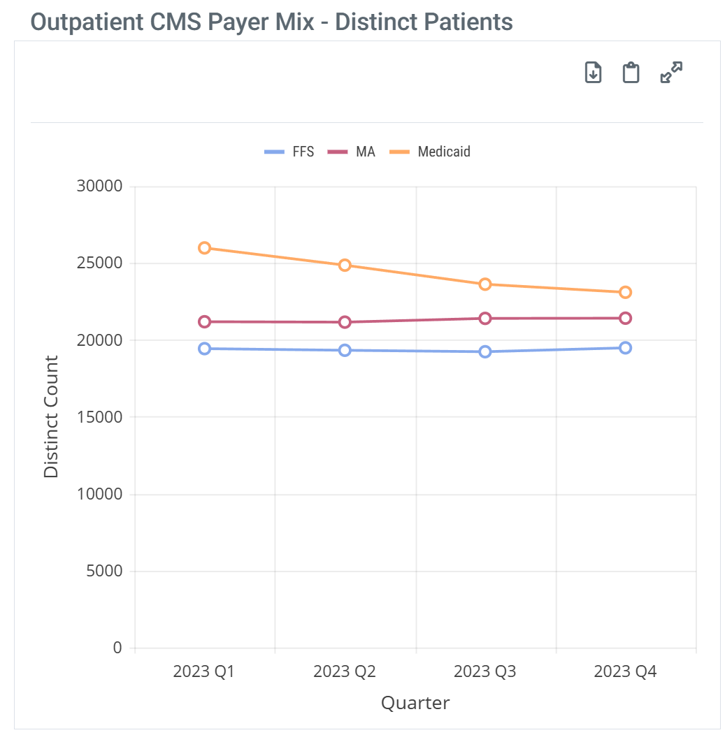 |
| When you hover over a line in the Outpatient CMS Payer Mix chart, the metrics for the different patient counts represented in the column are displayed. | 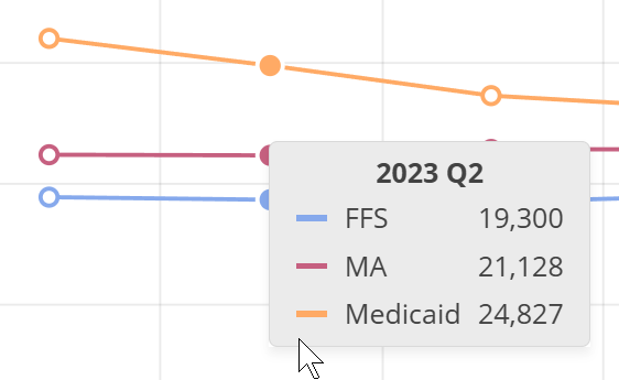 |
|
With chart view on the Outpatient CMS Payer Mix chart has a legend that identifies the elements in the chart. Each different identifier in the legend can be toggled on and off to display or hide the matching elements in the chart. Hovering over an identifier highlights the related elements in the chart.
| |
| Chart Legend | Legend Customize |
 |
 |
Metric Details
![]() The metrics in this table are about 2 years old because complete Medicare Advantage data is only available after that period. Medicare FFS metrics and Medicaid metrics are shown for the same periods in order to make comparisons meaningful.
The metrics in this table are about 2 years old because complete Medicare Advantage data is only available after that period. Medicare FFS metrics and Medicaid metrics are shown for the same periods in order to make comparisons meaningful.
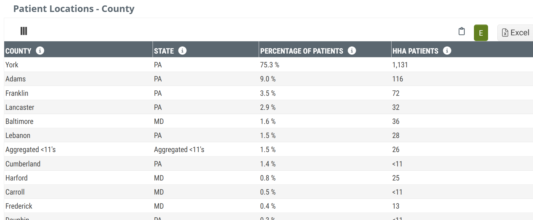
Patient Locations - County
This table shows the percentage of patients treated by the selected facility within the one year reference period who resided in the listed county at the time their initial facility admission claim was filed. The one-year reference period aligns with the end of the last quarter for the data set included in Trella Insights.
Chart View and Table View
|
Off
|
 |
|
On
|
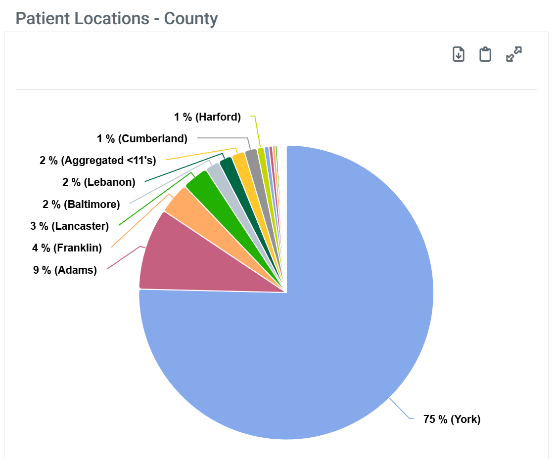 |
| When you hover over a sector in the Patient Location - County chart, the metrics for that sector are displayed. | 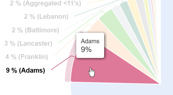 |
| The Patient Location - County chart does not have a legend. |
![]() The patient percentages in this table are calculated from all Medicare claims for the selected facility, not just patients with HHA related claims.
The patient percentages in this table are calculated from all Medicare claims for the selected facility, not just patients with HHA related claims.
County
For the selected facility, this table contains the names of the counties and the percentage of patients for each county from the facility's total patient count.
State
For providers who serve multiple states, sometimes there might be two counties in different states with the same name. We have added the state in which the county resides to differentiate the counties in this situation.
![]() Since these metrics are based on the patients' place of residence, it is possible to have counties from states other than the state of the facility's location. This will be especially true for facilities located in smaller states or near state lines. Those "out of state" counties will only be included in this table if there is a sufficient count of patients.
Since these metrics are based on the patients' place of residence, it is possible to have counties from states other than the state of the facility's location. This will be especially true for facilities located in smaller states or near state lines. Those "out of state" counties will only be included in this table if there is a sufficient count of patients.
Aggregated INS Counties and "Other"
- Any and all counties where the percentage was calculated from a count of less than 11 patients will not be identified in the table but will be aggregated into the row titled, "Aggregated INS County."
- For example, if the agency had 100 patients in the reporting period, any county with 10% of the total or less would represent less than eleven patients in that location and therefore, that location will not be identified, but would be combined with all other locations also not specified.
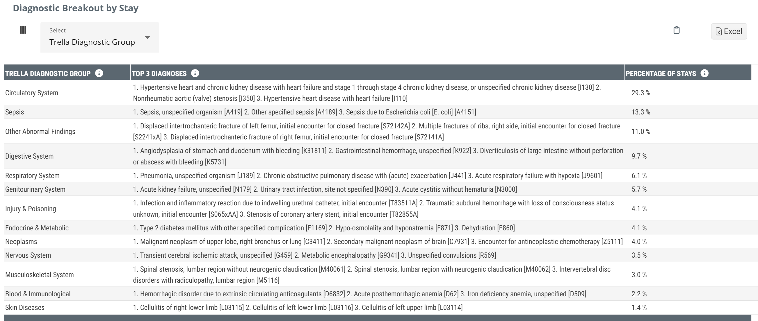
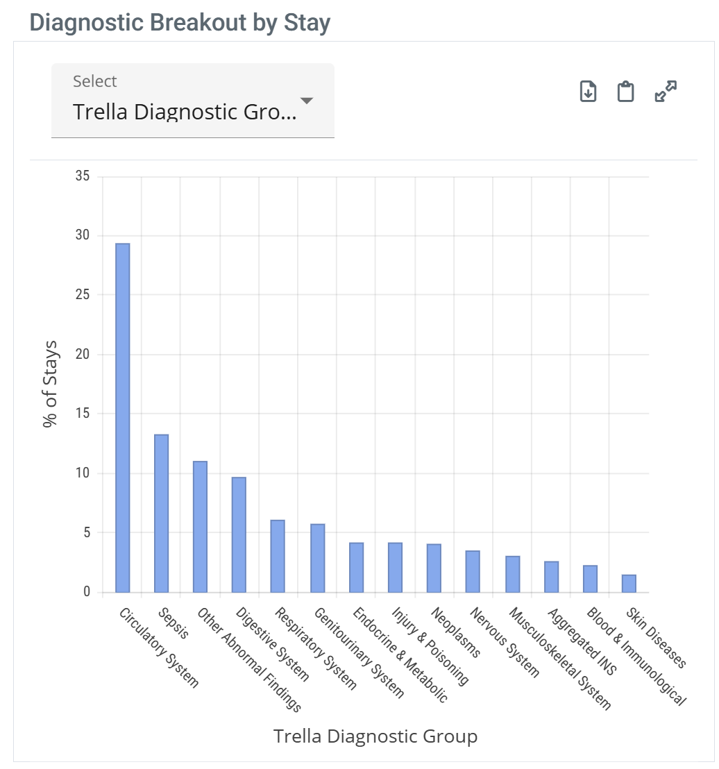
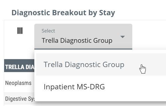
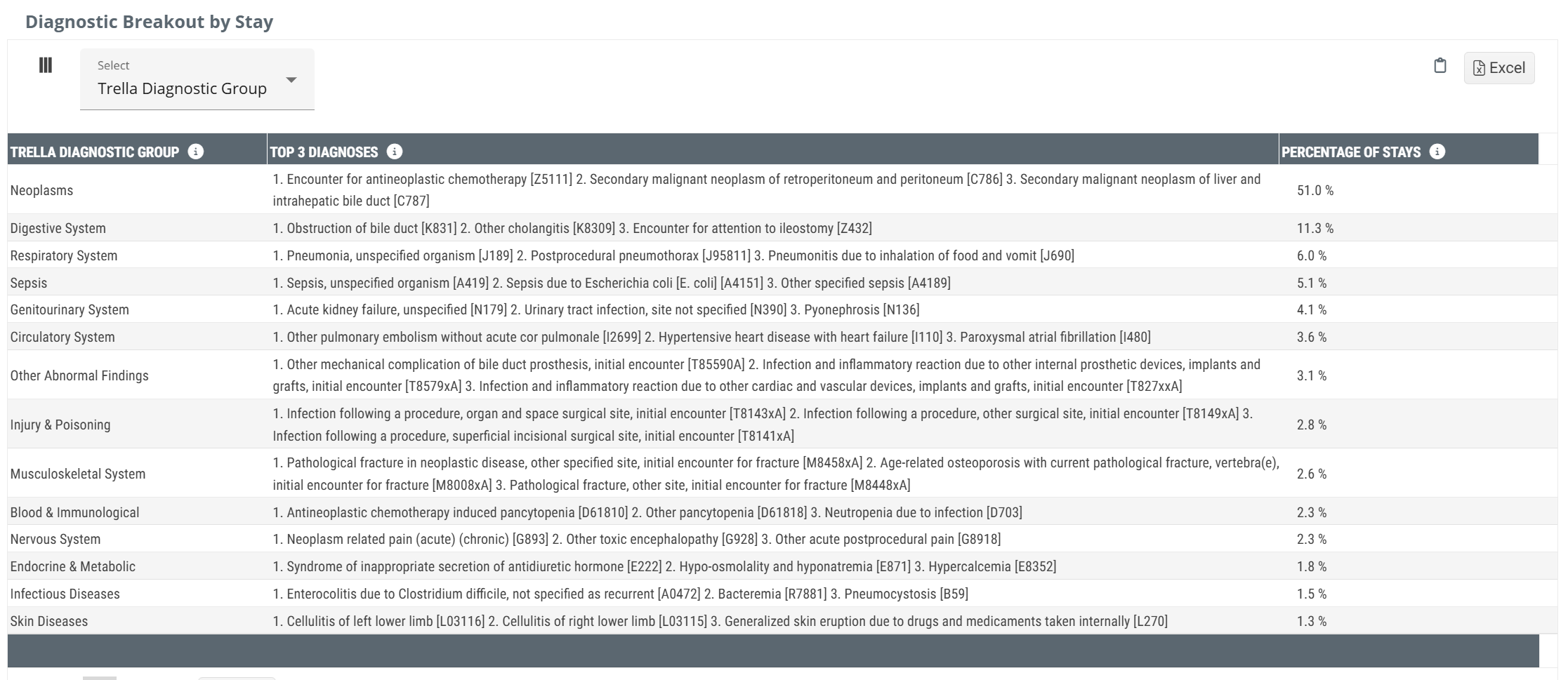
Diagnostic Breakout by Stay
Chart View and Table View
The Diagnostic Breakout by Stay has both a chart and a table view.
|
Off
|
 |
|
On
|
 |
|
|
 |
| When you hover over a bar in the Diagnostic Breakout by Stay chart, the metrics for that bar are displayed. | 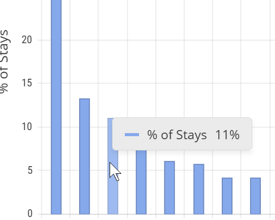 |
 Details
This table provides a percentage breakout by two different diagnosis models. For each diagnosis in either model, we provide a percentage of patient stays where the primary diagnosis on the claim aligns with the listed diagnostic category.
- Trella Health Diagnostic Grouping - This is Trella Health's unique diagnostic grouping model based on the ICD-10 Chapters. There are 20 different groups for all diagnoses, making this model very general.
- Diagnostic Related Group (DRG) - CMS uses this diagnostic grouping model as the model for billing under IPPS. There are more than 450 DRGs, so using this model allows you to identify the mix of diagnoses for your selected hospital in a high level of detail.
Trella Health Diagnostic Groupings
Use this diagnostic grouping model to identify broad areas of specialization as a connection between the selected facility and your agency.
Metric Name |
Description |
| Trella Diagnostic Group | The name of the Trella Diagnostic Group for which the content in the row aligns |
| Top 3 Diagnoses |
This column lists the top three diagnoses (based on the primary ICD-10-CM diagnosis code) for patients treated by the the selected facility that fall within the listed Trella diagnostic group. All of the Trella Health Diagnostic Groups have far more diagnosis codes. Use these as a general guideline. For details, see the article listed below. |
| Percentage of Stays | Percentage of stays with a primary diagnosis listed on the facility claim that falls within the Trella diagnostic group during the one-year reporting period. |
![]() Any and all diagnostic categories where the percentage was calculated from a count of less than 11 patients will not be identified in the table but will be aggregated into the row titled, "Aggregated INS diagnostic categories."
Any and all diagnostic categories where the percentage was calculated from a count of less than 11 patients will not be identified in the table but will be aggregated into the row titled, "Aggregated INS diagnostic categories."
![]() For more information see, Trella Health Diagnostic Groupings.
For more information see, Trella Health Diagnostic Groupings.
Inpatient MS-DRG
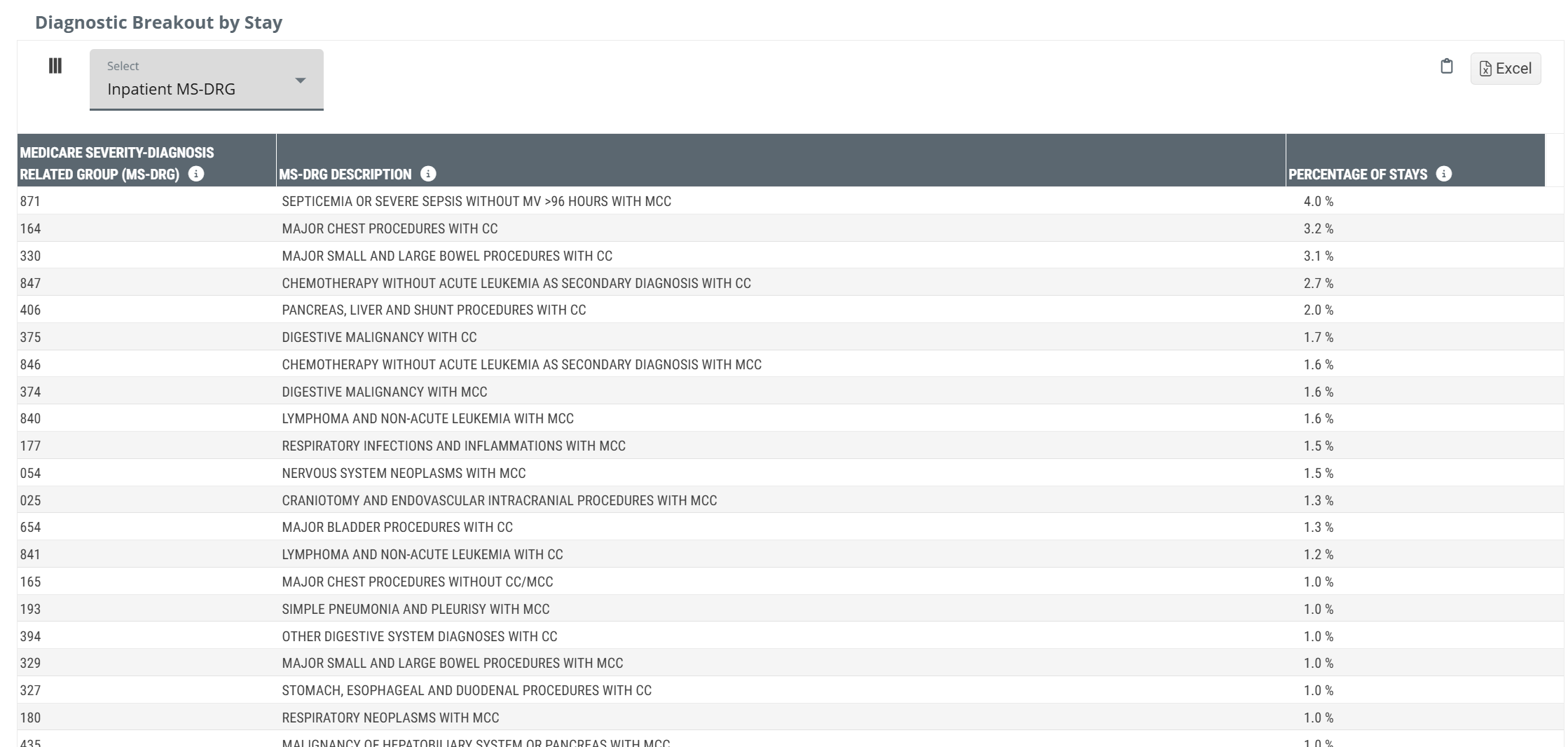
Metric Name |
Description |
| Medicare Severity-Diagnosis Related Group (MS-DRG) |
Medicare Severity-Diagnosis Related Group (MS-DRG) listed on the inpatient claim.
|
| MS-DRG Description | Description of the MS-DRG listed on the inpatient claim |
| Percentage of Stays | Percentage of stays with a primary diagnosis listed on the facility claim that falls within the listed MS-DRG during the one-year reporting period. |
As you can see from the image, using the Inpatient DRG diagnostic model provides a much more detailed view of the diagnoses for patients discharged from the selected hospital.
![]() Not all DRG's will be available in this table. We only include DRGs where the diagnosis represents >=11 distinct patients and more than 1% of the the total distinct patients.
Not all DRG's will be available in this table. We only include DRGs where the diagnosis represents >=11 distinct patients and more than 1% of the the total distinct patients.
These diagnoses percentages only apply to patients discharged from inpatient care at the selected hospital.
![]() CC is Complication or Comorbidity, MCC is Major Complication or Comorbidity.
CC is Complication or Comorbidity, MCC is Major Complication or Comorbidity.
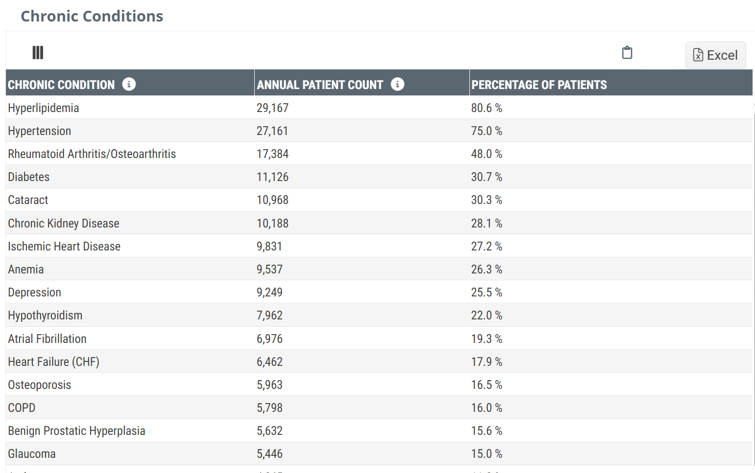
Chronic Conditions
This table shows distinct patient counts of patients treated by the selected facility who were diagnosed with the listed chronic conditions.
Chart View and Table View
|
Off
|
 |
|
On
|
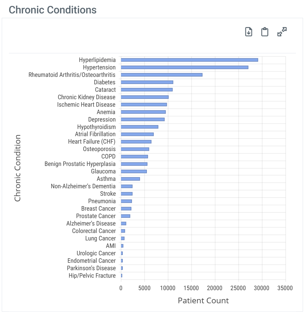 |
| When you hover over a bar in the Chronic Conditions chart, the metrics for that bar are displayed. | 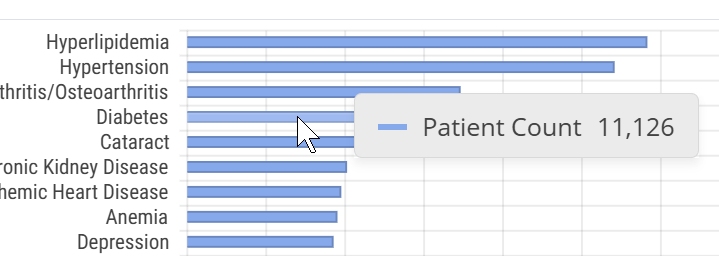 |
There is no legend for the Chronic Conditions table.
Metric Details
Metric name |
Definition |
| Chronic Condition | The name of the chronic condition for which the content in the row applies. |
| Annual Patient Count | The metrics in this column are the count of distinct patients treated by the selected facility during the reporting period who met the criteria for the listed chronic condition based on the CCW Chronic Condition algorithm |
| Percentage of Patients | The metrics in this column are the percentage of distinct patients treated by the selected facility during the reporting period who met the criteria for the listed chronic condition based on the CCW Chronic Condition algorithm |
![]() The percentages in the table will not add up to 100% since many patients will be identified with a diagnosis included in more than one row.
The percentages in the table will not add up to 100% since many patients will be identified with a diagnosis included in more than one row.
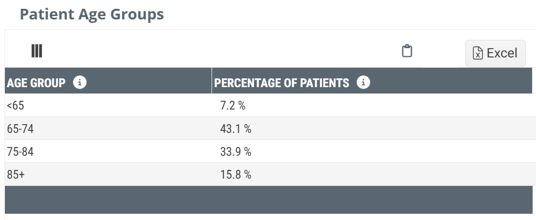
Patient Age
This table gives a simple breakout of the patients treated by the selected facility during the reporting period by age.
Chart View and Table View
|
Off
|
 |
|
On
|
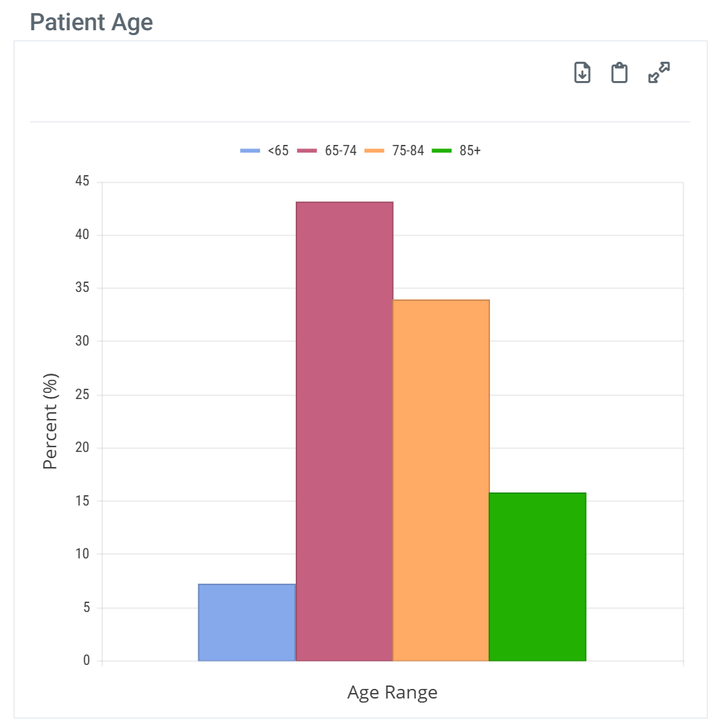 |
| When you hover over a sector in the Patient Age chart, the metrics for that bar are displayed. | 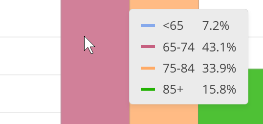 |